The Duo-assed App
On October 23rd every iPhone app becomes a foldable app, whether its developer planned for it or not. Anyone not doing any work, or at least very up to date on using SwiftUI, will get a phone app sitting in a box (that seems familiar…). Or a phone app stretched across a screen shape it was never tested for.
I have to assume the ones that get it right will stand out the way the good iPad apps did in 2010, and for the same reason.
A while back I spent some time on the “Mac-assed Mac app,” Collin Donnell’s phrase that Brent Simmons made stick: the app that is unapologetically built for the Mac and behaves the way a Mac user’s hands expect. I made good use of the principles that arose from that conversation to make sure my own Mac apps stayed in the lines.
Pretty clearly to me, the Duo needs the same idea. So, with apologies to everyone: the Duo-assed app.
Deja Vu
I’ll single out Marco Arment because he’s been out there being vocal about this awhile. The night after the iPad was announced, he recompiled Instapaper for it. It took almost no work. His report:
“Everything except the reading screen looks ridiculous.”
Nobody outside Apple had an iPad. He’d already built one out of cardboard the day it was announced, and decided his assumptions about typing on it “may have been premature.” Over at Omni, Ken Case 3D-printed a fake iPad with a dock connector and the team ran paper prototype tests on it.
Marco shipped on day one anyway, blind, because the alternative was Apple’s pixel-doubled compatibility mode and in his words that “sucked.” Eleven days before launch he wrote the sentence that matters most here:
“I don’t yet know how I’ll hold the iPad when reading.”
Three weeks after he had a real one, Instapaper 2.2.3 came out. Controls moved to the top. Margins got much thicker, because the screen was “actually too large for comfortable text reading spanning the entire width.” He added a brightness control because the thing was too bright in a dark room. He reworked the tap zones because an iPad is “usually held two-handed by its sides.”
Grip, thumbs, glare, and line length. None of that shows up in a simulator.
He did it again five years later with the Apple Watch. He scaled Overcast’s iPhone structure down to fit, which “seemed like a sensible adaptation.”
“In practice, it sucked.”
He rebuilt it after one day of wearing the real thing.
Android has been there, didn’t really ‘done’ that though
Foldables aren’t new. Samsung shipped the first Galaxy Fold in 2019, and Android developers have had seven years with these things. What did they learn?
The first bug in every Android write-up I found is the same bug. You fold the phone and the app forgets what you were doing. Samsung warned about it before the first Fold shipped. Google’s Pixel Fold guide in 2023 was still warning about it: “If your app loses state, the user loses all previous form entry data and is forced to start all over.”
The second lesson is that apps which refuse to adapt eventually get adapted by force. Instagram sat letterboxed on the Galaxy Fold until late 2023… Google tried encouragement, then Play Store ranking, then had Android 16 start ignoring apps’ orientation locks on big screens, and this year Android 17 took away the opt-out. The first Pixel Fold opened to a landscape screen, so portrait-only apps sat in the middle of it between black bars, and the next model changed the shape of the screen, in part because of that.
And after all of that, here is John Gruber’s summary of where Android ended up: “no developers truly adapted software to take advantage of the double-area inner displays.”
Apple spent years on the other side of this argument. At a 2012 keynote Tim Cook put Twitter’s app from a Samsung tablet on screen and said it “looks like a blown-up smartphone app, because that’s exactly what it is.” That slide can now be made about us.
I think Android and iOS developers are different audiences serving different users for the most part though, with different incentives and ‘taste’.
What Apple changed
Apple has been laying track for this for a long time. Size classes showed up in 2014, three months before the first big iPhone. Last year Liquid Glass turned toolbar buttons into symbols, and this June iPhone apps became resizable under iPhone Mirroring. Nathan Manceaux-Panot wondered out loud whether the Duo is why Liquid Glass pushed icon buttons so hard. Toolbars on the Duo run vertically down the side of the screen, and a column of buttons only works if the buttons are icons.
That side bar is the most visible change. The outer display is wider and shorter than any iPhone, so the navigation bar, toolbar, tab bar, status bar, and Dynamic Island all stack along one edge and leave the content a normal phone-shaped area. You get it for free if you use the system’s navigation containers. You never get it if you drew your own bars. Apple had to pay this debt too: Maps and Find My were moved off custom bars in this release to get the behavior.
The rest: the fold is a “reserved region” your layout avoids when the phone is partly folded, there is 50/50 Split View on an iPhone, the inner display ignores your portrait lock, and closing the phone resizes your running app onto the outer display instead of relaunching it. There is no supported way to ask whether you’re on a Duo. You get a size, and the size changes. One developer asked in Apple’s forums whether their small utility could stay half-width and leave room for another app beside it. Apple’s answer started with “No you cannot.”
What makes an app Duo-assed
I wrote up the long version as a guide. The short version is five main things.
The fold happens at any time. People will close the phone while typing a reply and open it again on the couch. The draft, the cursor, the scroll position, the sheet that was up, and the song that was playing all come along. An Apple engineer said in a developer lab last week that a SwiftUI app which swaps its root view on size class “will see state loss” on fold. Go look for that if statement…
A convertible isn’t a sedan with the roof cut off. The roof was integral to holding the car together, so the stiffness has to be rebuilt into the floor. Same here. If your app’s state lives in the view tree, the fold saws it off. Put it underneath.
Open shows more. One of the Apple design videos says “You don’t want just a stretched out iPhone app.” (no kidding) Mail shows a list closed, and the list plus the message open. Same hierarchy, one more level of it. It isn’t an iPad either. Apple’s Phone team made the dialer a tab where the iPad uses a popover, because “this is a phone.”
Closed is a small phone. Casey Liss’s first look at Callsheet in the simulator: “Opened: looking good! Closed: Dear God no.” The outer display is small and short, and the keyboard eats a lot of it. I have no idea yet how often people will bother opening the thing, so the closed layout gets the same care as the open one.
Let the bars go to the side. Every toolbar item gets a symbol and a title, the thing people tap most is the last thing to overflow, and you don’t fight the placement. Happily enough even not thinking about Duo world I’ve found myself gravitating to toolbar styles that suit this over the last year.
Nothing in the crack crease, and nothing locked to a pose. One half-folded layout has held up since the early Android foldables, and Apple’s TV app uses it too: look at the top half, touch the bottom half. But Apple also claims 90% of layouts need nothing special, and Greg Pierce has a point when he says most of the work goes to folded modes that about 1% of iPhone users will use less than 5% of the time. Make the poses correct. Make them special only if your app is video, calls, camera, or reading.
What it did to my own app
I’ve been toiling away checking all my apps, especially the one I think will appeal to the sort of person who will be buying a Duo in year one. But the one I can talk about that I learned the most from is my Big Sky Field Guide, a tourist guide to Big Sky for visitors, with hand-drawn 3D maps of the valley and the ski slopes. Earlier this month I built its iPad layout: the contents down the side and the page beside them, the way a guidebook opens flat. The code picks between the phone layout and that one on size class. And of course that’s never reached on the phone…
The Duo’s inner display is regular width. The phone reaches that file every time it opens.
Closed, the app needed nothing. The toolbar moved into the side bar on its own. Open, it got the iPad layout. And folded partway, like a book, the line between the contents and the page landed on the fold: contents on the left page, the entry on the right. I didn’t write a line of code for any of it. Not too shabby.
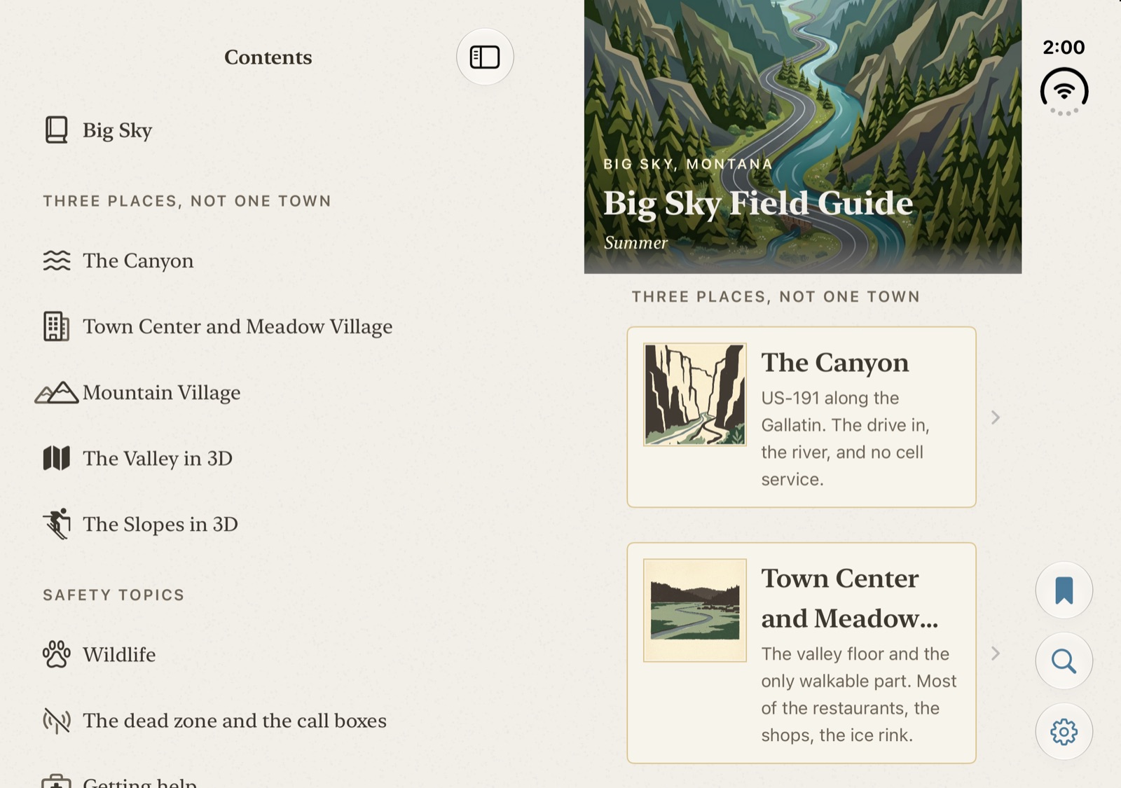
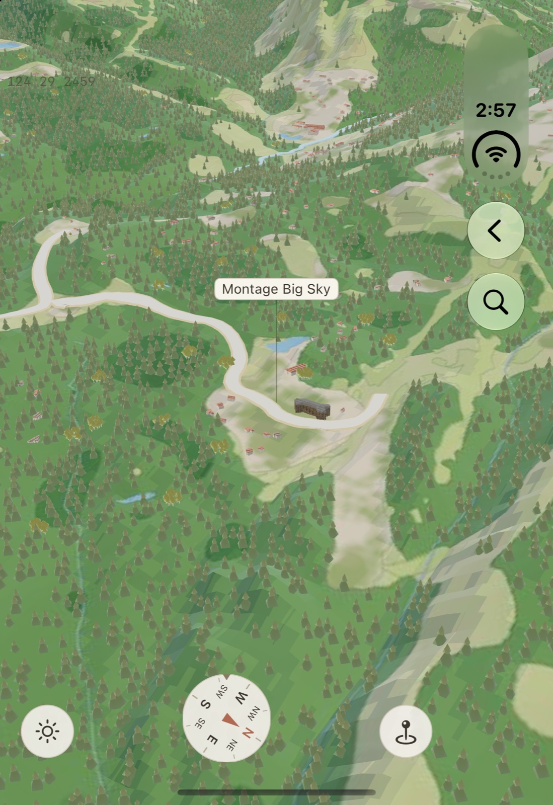
Then I used it the way a person would. Closed, I went into the 3D map of the valley and zoomed in on Montage Big Sky.
Then I opened the phone.
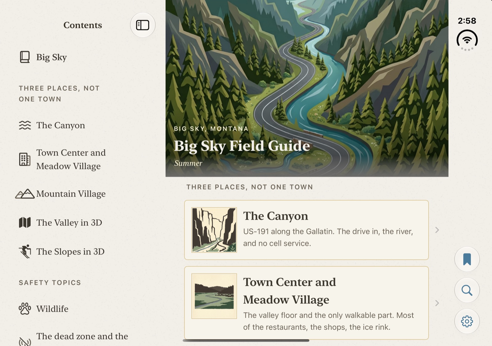
Same running app. No crash, no relaunch, and I’m back at the front door of the guide. Closing it again didn’t bring the map back either. It went to the phone’s home screen. The place was lost in both directions.
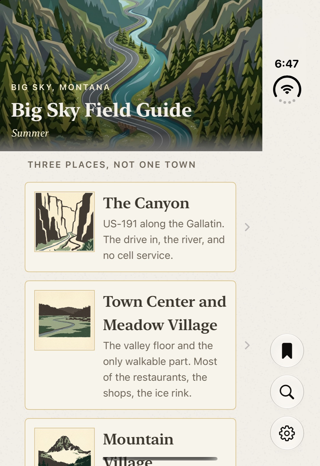
The map itself was fine. Left running on its own, it went through laptop, book, open, and closed without losing its heading once. What threw me out was that one if at the root. Open and closed are two different view trees, and swapping one for the other throws away everything the first one was holding. It’s the exact bug Apple folks mentioned in the labs.
The rest of the list is smaller:
The card for a place picks its style by asking whether it’s on an iPad. A Duo says it’s a phone, so the big inner display gets the phone’s sheet.
The phone is locked to portrait because the drawn maps were composed tall. The inner display ignores the lock and shows them wide. My own comment in the iPad code says a wide frame is how the valley was composed in the first place, so the Duo may be doing the maps a favor.
Closed, the map runs under the side bar, which is right for a map, but a place label ended up under the search button.
Laptop pose is where I think the app can be better on a Duo than anywhere else. Today the map fills the screen with the fold across the middle of the valley. The plan is the map on the upright half and the place you tapped on the half resting on the table. I think that will be cool? Definitely a case for being hands-on, maybe it will feel cramped and small when not simulated on my 6k monitor.
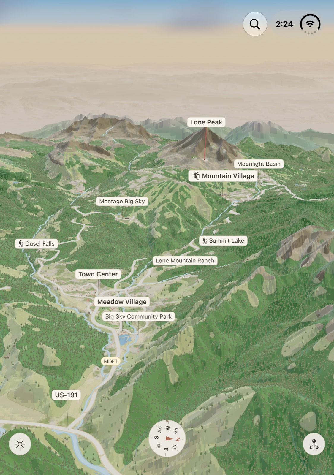
So the work is: move the reader’s place out of the view tree so both layouts read it, make the root one container that changes shape instead of two that swap, pick the sheet by the space it has, and build the laptop map.
Is it worth it for a $1,999 phone? If the work were only for the Duo, I’d say probably not. Greg Pierce said as much: “don’t do it for Apple… Don’t do it for sales.” But the work is resizable layouts, state that survives a layout change, and system bars. That’s the same work the iPad wants, and iPhone Mirroring, and whatever comes next. Matt Birchler’s puzzle game needed zero code changes because he had already done it. Casey Liss, five days into the simulator: “Don’t keep punting on being a good platform citizen.” For him the overdue bill was running more than one copy of the app at once.
The simulator shipped on September 18th. Of course simulators have no cameras and can’t light both sides… As Steve Troughton-Smith said: “you damn well better have one of these devices on hand.”
Craig Hockenberry looking at a keyboard layout with controls sitting in the crease named three fixes that might each be right… “Don’t tell me which one you prefer unless you have a Duo in hand.”
So all my thinking so far is a “cardboard iPad”. It’s my best reading of Apple’s material, Android’s seven years, and what happened the last four times. I’m still building from it, and buckled down to be ready for day one. And I reserve the right to take back everything I said.